Carbon dioxide emissions, also known as c02 emissions are a type of greenhouse gas that is colorless and odorless. Today, with global warming we see an increase of c02 emissions which can create negative impacts on the earth. Humans breath out carbon dioxide, however this c02 is not considered bad for the Earth. The negative impacts typically come from burning fossil fuels, car gas, nitrogen gas, etc. In this analysis, we are going to look at how the impacts of food consumption play a role in c02 emissions.Our variables we are working with are country, foot category, consumption, and c02 emission. The goal is to prove four distinct hypotheses;(1) Beef and milk/cheese play the most prominent role in c02 emission, (2) China and the US are two countries that play a huge role in consumption as well as c02 emission(3)The consumption of milk/cheese is greater than the consumption of beef.(4)Soybeans and wheat products have the least amount of consumption rates as well as the least amount of c02 emission. This information will allow individuals to look at the differences in countries regarding c02 emission as well as what foot categories are more negative in the impact than others.
Rows: 1430 Columns: 4
── Column specification ────────────────────────────────────────────────────────
Delimiter: ","
chr (2): country, food_category
dbl (2): consumption, co2_emmission

ℹ Use `spec()` to retrieve the full column specification for this data.
ℹ Specify the column types or set `show_col_types = FALSE` to quiet this message.
In this block of code we are splitting our data into two sets, training and test. The training set is visible and is used to fit the model whereas the test set is shown at the end and only used for final predictions.
Hypotheses: Beef and milk/cheese play the most prominent role in c02 emission.
China and the US are two countries that play a huge role in consumption as well as c02 emission.
The consumption of milk/cheese is greater than the consumption of beef.
Soybeans and wheat products have the least amount of consumption rates as well as the least amount of c02 emission.
We are about to look at our variables, consumption and c02 emission and declare the mean, sd, min, max and p0 in the training data set. This will allow us to compare different countries to the average and declare whether they have negative or positive impacts.
training_data %>%#gives us three different panels; min,max, mean, sd, p0. skim()
Data summary
Name
Piped data
Number of rows
715
Number of columns
4
_______________________
Column type frequency:
character
2
numeric
2
________________________
Group variables
None
Variable type: character
skim_variable
n_missing
complete_rate
min
max
empty
n_unique
whitespace
country
0
1
3
22
0
130
0
food_category
0
1
4
24
0
11
0
Variable type: numeric
skim_variable
n_missing
complete_rate
mean
sd
p0
p25
p50
p75
p100
hist
consumption
0
1
29.45
51.78
0
2.35
8.76
28.37
341.47
▇▁▁▁▁
co2_emmission
0
1
71.49
146.77
0
5.20
16.19
58.70
1211.17
▇▁▁▁▁
The data above tells us that the mean consumption is believed to be 28.66kg per person per year and the mean c02 emission is 80.60kg per person per year. We also see a big difference in standard deviation rates, consumptionbeing 48kg and c02 emission being 167kg.
We are about to compare the whole training datasets mean and sd to the US. This will allow us to declare what kind of impacts the United States is having on C02 emissions.
training_data %>%filter(country =="USA")%>%skim()
Data summary
Name
Piped data
Number of rows
5
Number of columns
4
_______________________
Column type frequency:
character
2
numeric
2
________________________
Group variables
None
Variable type: character
skim_variable
n_missing
complete_rate
min
max
empty
n_unique
whitespace
country
0
1
3
3
0
1
0
food_category
0
1
4
24
0
5
0
Variable type: numeric
skim_variable
n_missing
complete_rate
mean
sd
p0
p25
p50
p75
p100
hist
consumption
0
1
25.55
32.29
0.43
6.88
12.35
27.64
80.43
▇▂▁▁▂
co2_emmission
0
1
31.35
37.37
8.80
15.06
15.34
19.72
97.83
▇▁▁▁▂
We can see that the mean consumption rates are about 18.04kg per person per year whereas the c02 emission is 311.27kg per person per year. The consumption rates fall under the training dataset mean whereas the c02 emission is almost three times the training average. This explains that we have less consumption but within that consumption there are foods that contribute more to c02 emission.
We are about to compare the whole training datasets mean and sd to China. This will allow us to declare what kind of impacts China is having on C02 emissions.
From the data above, we can see that the mean consumption rate is 18kg per person per year and the c02 emission is 102kg per person per year. The consumption value fall below average when compared to the training data set mean, whereas the c02 emission is about 20kg over. This is not too bad as it falls one standard deviation above the mean and may be considered ‘normal’. Looking at these results I was shocked that China did not contirbute more to the c02 emission rates due to the industrial boom.
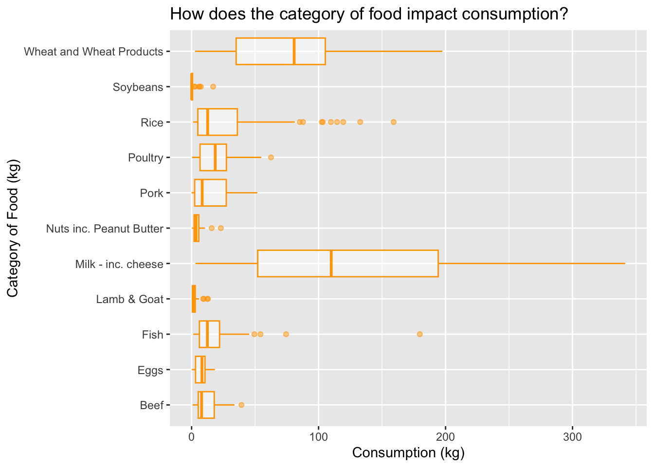
We are about to see how the category of food impacts consumption rates. This is important because is allows us to see what types of food are being consumed more than others, as well as which ones are not.
training_data %>%ggplot()+geom_boxplot(aes(x=food_category, y = consumption), color ="orange", alpha=0.5) +labs(title ="How does the category of food impact consumption?",x="Category of Food (kg)", y ="Consumption (kg)") +coord_flip() #flips your coordinates!!!! so helpful
From this boxplot above, we can see that the category of food that is consisted of milk and cheese has the highest consumption (kg) per person per year with an average of around 120kg. This proves our hypothesis of milk and cheese products having higher rates than beef. However, we also see comsumption outliers that exceed to almost 300kg, this depicts a large range in differences regarding countries worldwide. The second highest is wheat products and the least amount of consumption per person per year is soybeans and nuts/peanut butter.
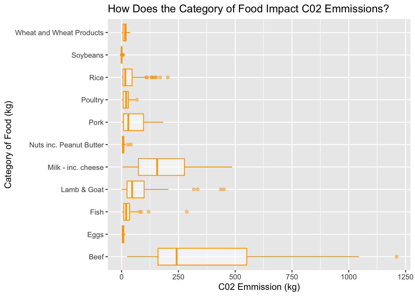
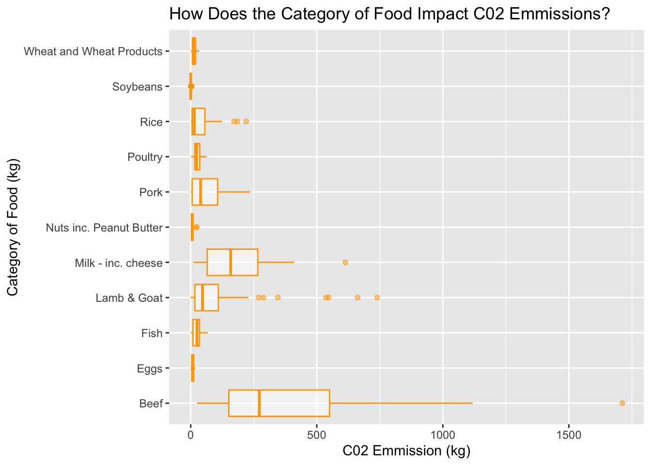
We are about to take our training data and create a boxplot that differentiates how the category of food impacts c02 emissions. This tells us what types of foods are having negative impacts on the environment. In his graph we will be seeing if our hypothesis ‘Beef and milk/cheese play the most prominent role in c02 emission’ is truthful.
training_data %>%ggplot()+geom_boxplot(aes(x=food_category, y = co2_emmission), color ="orange", alpha=0.5)+labs(title ="How Does the Category of Food Impact C02 Emmissions?",x="Category of Food (kg)", y ="C02 Emmission (kg)") +coord_flip()
From the boxplot above, we can see that our hypothesis was in fact true. Beef and milk products play a prominent role in c02 emissions. However, beef has a wide range with the mean being around 250kg per person per year. We can see outliers for beef c02 emission rates that go past 1500 kg. According to this graph, nuts and eggs have nearly 0 kg. Eventhough our hypotheses declares soybeans as the creating least c02 emission, we can see there are other categories of food that create even less. This information is beneficial for individuals trying to decrease their carbon footprint by diet.
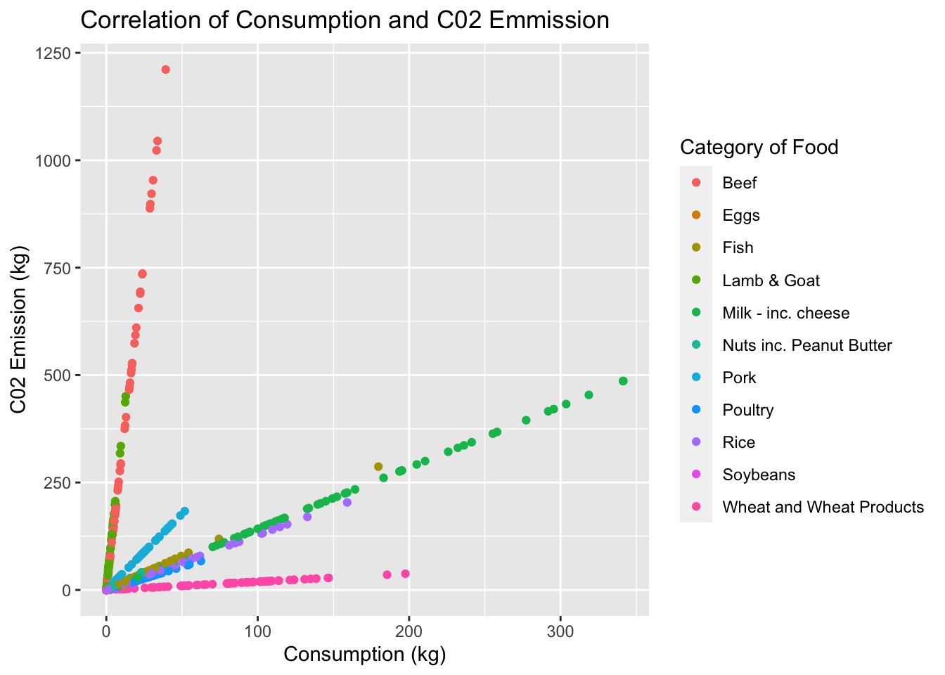
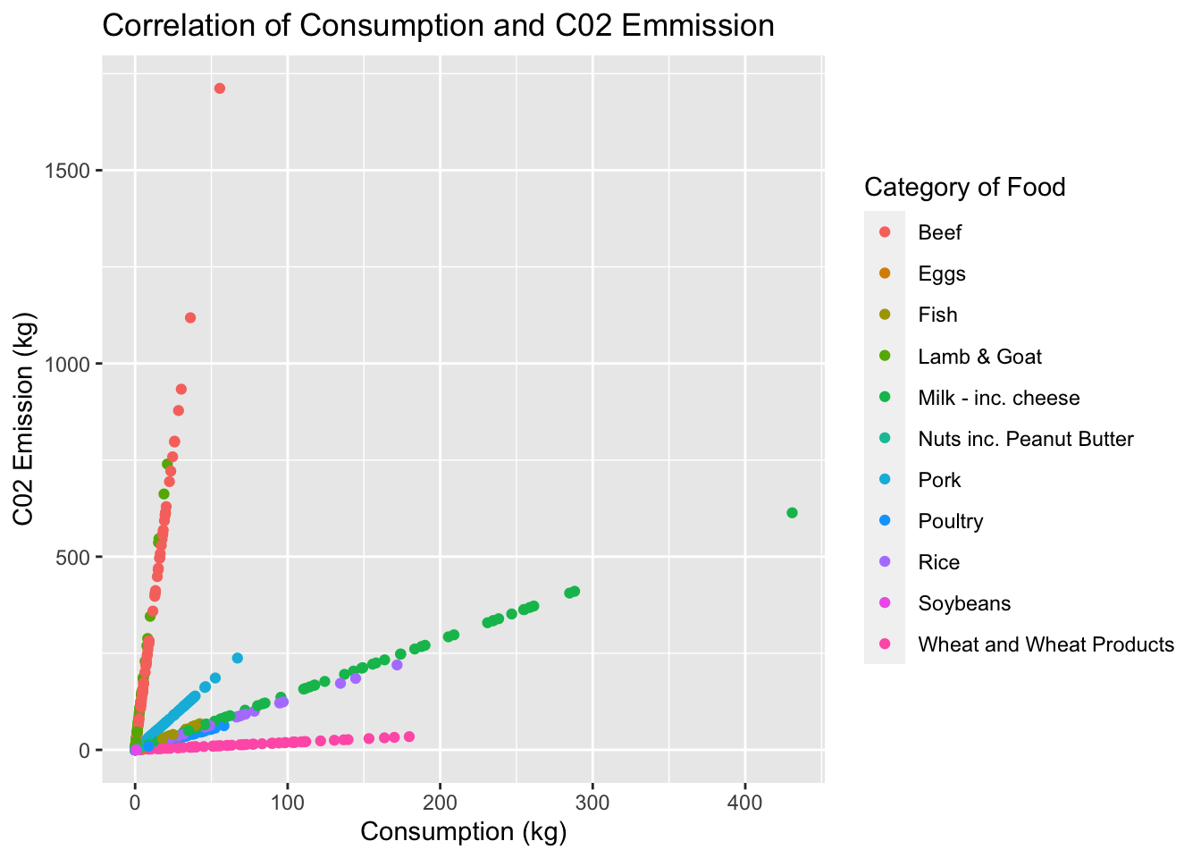
We are about to look at the training data and depict the correlation between consumption rates and c02 emissions. We are going to color this scatter plot by the category of food, esentially putting both previous graphs together into one.
training_data %>%ggplot(aes(x=consumption,y = co2_emmission, color= food_category)) +geom_point() +labs(title ="Correlation of Consumption and C02 Emmission",x="Consumption (kg)",y="C02 Emission (kg)",color="Category of Food")
From the scatterplot above, we can see that the consumption of beef and c02 emission that is emitted are correlated and sky rocket. Wheat products are at a constant 0kg throughout consumption rates and milk products have a smaller slope but there is also a correlation between these two variables. This tells us that beef plays a negative and drastic role in c02 emission.
Looking at our training data, we can assume that beef has the highest significance to c02 emission rates which is what was hypothesized. Soybeans and nuts have the least effect on c02 emission which was also hypothesized.Two interesting things I found were the specific country comparisons to the average training values. Looking at China and the United States, I assumed that these countries values on c02 emissions would be relatively high due to the big industries these two countries have. When skimming the data, the United States showed very high results in c02 emissions at almost three times the training mean. China showed a mean that was not too different from the training mean which was the most shocking, I would have assumed their value would be almost as big if not as big as the United States. Overall, the majority of the hypotheses created were true and presented highly interesting results. ## Methodology/Inference
Here we are going to be using our test data to test our inferences. Using this test data will allow us to see how well our training data set fits these model predictions.
We are about to look at our variables, consumption and c02 emission and declare the mean, sd, min, max and p0 in the test data set. This will allow us to compare the differences between our training data set model and our test data set to see how accurate our previous models were.
test_data %>%#gives us three different panels; min,max, mean, sd, p0. skim()
Data summary
Name
Piped data
Number of rows
715
Number of columns
4
_______________________
Column type frequency:
character
2
numeric
2
________________________
Group variables
None
Variable type: character
skim_variable
n_missing
complete_rate
min
max
empty
n_unique
whitespace
country
0
1
3
22
0
130
0
food_category
0
1
4
24
0
11
0
Variable type: numeric
skim_variable
n_missing
complete_rate
mean
sd
p0
p25
p50
p75
p100
hist
consumption
0
1
26.77
47.78
0
2.44
8.98
26.86
430.76
▇▁▁▁▁
co2_emmission
0
1
77.28
157.30
0
5.28
16.75
65.36
1712.00
▇▁▁▁▁
The data above tell us that the mean consumption is about 27.5kg per person per year which is very similar to our previous mean of 28kg in the training data set.The mean c02 commission is about 68.16kg per person per year. This value is also failry close to 80kg, which is the value found in our training data. Our standard deviation values are 27.5kg for consumption and 134kg for c02 emission.
We are about to compare the test dataset mean and sd to the US. This will allow us to declare what kind of impacts the United States is having on C02 emissions and how different they are from the previous training dataset values.
test_data %>%filter(country =="USA")%>%skim()
Data summary
Name
Piped data
Number of rows
6
Number of columns
4
_______________________
Column type frequency:
character
2
numeric
2
________________________
Group variables
None
Variable type: character
skim_variable
n_missing
complete_rate
min
max
empty
n_unique
whitespace
country
0
1
3
3
0
1
0
food_category
0
1
4
23
0
6
0
Variable type: numeric
skim_variable
n_missing
complete_rate
mean
sd
p0
p25
p50
p75
p100
hist
consumption
0
1
60.57
96.90
0.04
9.54
25.41
46.57
254.69
▇▁▁▁▂
co2_emmission
0
1
260.35
442.43
0.02
13.52
33.82
285.52
1118.29
▇▂▁▁▂
This data shows us that the mean consumption rate is 59.8kg per person per year whereas the mean c02 emission is 67.6kg per person per year. The mean consumption falls above the total mean of the test set whereas the c02 emission surprisingly falls below - by less than one kg. It is interesting to see the United States making a less of an impact in our test data set since in our training there was a three times increase.
We are about to compare the test dataset mean and sd to the China. This will allow us to declare what kind of impacts China is having on C02 emissions and how different they are from the previous training dataset values.
test_data %>%filter(country =="China") %>%skim()
Data summary
Name
Piped data
Number of rows
8
Number of columns
4
_______________________
Column type frequency:
character
2
numeric
2
________________________
Group variables
None
Variable type: character
skim_variable
n_missing
complete_rate
min
max
empty
n_unique
whitespace
country
0
1
5
5
0
1
0
food_category
0
1
4
24
0
8
0
Variable type: numeric
skim_variable
n_missing
complete_rate
mean
sd
p0
p25
p50
p75
p100
hist
consumption
0
1
28.96
28.63
3.13
4.75
19.89
44.66
78.18
▇▅▂▁▅
co2_emmission
0
1
71.02
61.76
1.65
15.94
66.80
116.21
157.99
▇▂▁▅▅
From the data above, we can see that the mean consumption rates are 28kg per person per year whereas the mean c02 emission is about 41.5kg per person per year. The mean consumption is higher than the test mean by less than one which is not too significant and the c02 emission is less than about 27kg. Still, we see no negative impacts from China regarding c02 emission which is a shocking discovery.
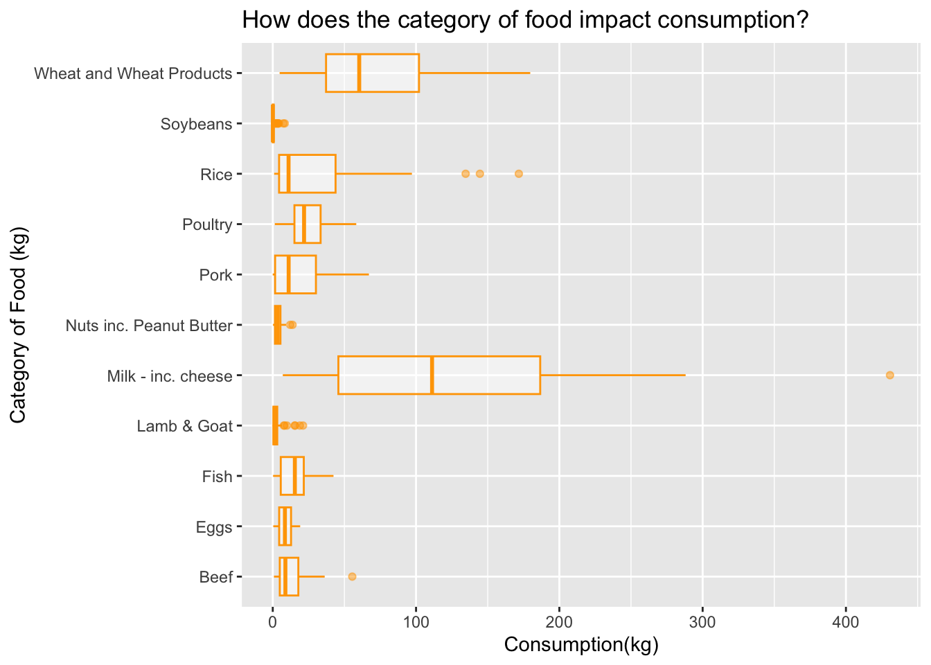
We are about to see how the category of food impacts consumption rates in our testing data. This is important because is allows us to see what types of food are being consumed more than others, as well as which ones are not.
test_data %>%ggplot()+geom_boxplot(aes(x=food_category, y = consumption), color ="orange", alpha=0.5) +labs(title ="How does the category of food impact consumption?",x="Category of Food (kg)", y ="Consumption(kg)") +coord_flip() #flips your coordinates!!!! so helpful
From the boxplot above, we can see that milk and cheese products are still the most consumed whereas what products come in second. Our hypotheses for highest consumption still follows as truthful when using the test data. It is important to note that beef has fewer consumption rates than it did in the test data set. The lowest consumption in this data is lamb/goat products as well as soybeans.
We are about to take our test data and create a boxplot that differentiates how the category of food impacts c02 emissions. This tells us what types of foods are having negative impacts on the environment. In his graph we will be seeing if our hypothesis ‘Beef and milk/cheese play the most prominent role in c02 emission’ is truthful in the test data set as well.
test_data %>%ggplot()+geom_boxplot(aes(x=food_category, y = co2_emmission), color ="orange", alpha=0.5)+labs(title ="How Does the Category of Food Impact C02 Emmissions?",x="Category of Food (kg)", y ="C02 Emmission (kg)") +coord_flip()
Looking at the boxplot above, it is visible that beef has the highest c02 emission rates with a mean greater than 250kg per person per year. This is right about what our average was for the training data. Second products that produce the most c02 emission are milk/cheese products which seconds our hypotheses that was proved during our training exploratory analysis. The products that produce the least amount of c02 emissions are soybeans, and eggs.
We are about to look at the test data and depict the correlation between consumption rates and c02 emissions. We are going to color this scatter plot by the category of food, essentially putting both previous graphs together into one.
test_data %>%ggplot(aes(x=consumption,y = co2_emmission, color= food_category)) +geom_point() +labs(title ="Correlation of Consumption and C02 Emmission",x="Consumption (kg)",y="C02 Emission (kg)",color="Category of Food")
From the scatterplot above, it is noted that beef, milk/cheese, rice, and poultry have definite correlations when taking into consideration c02 emission rates and consumption. Each of these categories have distinct slopes; beef has a very high slope whereas wheat products has a smaller slope, closer to 0. Just like our training data, beef is sporadic which tells us it plays a negative role in Earths c02 emissions.
Overall, the test data has been hidden until the inference portion of this analysis. Using the test data allowed us to look at our training datasets and compare how well our predictions were.
Conclusion
In conclusion, the training data and the test data yielded similar results for the most part. The only significant difference was the mean in c02 emissions for the United States, it appeared to be very low whereas in the training set it was three times higher. This could correlate to the amount of data observations we have in the test data, since out training has 3/4 of our information stored. Otherwise, beef was noted to have the highest correlation in regards to c02 emission but less when looking at consumption. Our hypotheses were mostly proven true, the only shocking discovery was that China did not produce as high c02 emission rates that I believed they were going to. This could have something to do with when these data observations were taken. For future projects I would like to examine a data set of c02 emissions and food consumption that was taken in the last year to declare any significant changes from what was missing in this dataset.